Hello readers, it has been far too long since I last wrote an entry for this blog. I have been writing a lot, but all of my work has been focused toward school and projects that I hope to have published later. Since I do not want to scoop myself on my research that means that most of what I am spending my mental energy on these days is stuff that I can't put in the blog. However, this last term I took a statistics class, and my final project for that was actually stuff I was looking at so that I could use it in the blog. So for your reading pleasure, here is my unedited paper:
Correlations Between Crime, Employment, and Government (Or the lack thereof)
The objective of this project was exploratory analysis. In my non-academic writings I frequently write about crime statistics, with a special focus on homicide and gun violence statistics. There is a wealth of well-done analyses that look various aspects of homicide rates, but there is less attention paid to the relationship that homicide has with other types of crime, or to broader societal trends. The FBI publishes numerous in depth statistical analyses of crime rates and trends (FBI, Numerous Dates), including ones that look at rates of different types of crime compared to each other, so my goal in this project was not to duplicate those analyses, but rather to look at the relation of crime rates to employment statistics and political leadership to see if there were hidden trends I could uncover and analyze.
In order to look at the relationships between crime, employment, and government I first had to decide on a scope. I chose to run the analyses on the national level in order to look at broad trends. I then needed to source my data and produce a usable dataset for analysis. I conducted a number of descriptive time-series plots, simple Spearman’s correlations (in recognition of the non-parametric nature of much of the data), Pearson’s pairwise correlations for comparison, and ultimately decided that a Principle Component Analysis (PCA) would be the most useful tool to indicate follow up analysis directions.
Unfortunately, the data I was using was only appropriate for PCA is I removed all but the crime rate data. I conducted the analysis, but the results are not anything ground breaking. While I have not seen a PCA of violent and property crime rates through time in official governmental analyses, the information I was able to glean is ultimately duplicated in a number of easily accessible sources. My analysis failed to identify hidden trends, and my exploratory analysis failed to explore new areas of inquiry, but I was able to at least conduct sufficient correlational operations to suggest that further analysis was unlikely to result in valuable insight. This was not the outcome I hoped to achieve, but I had been aware of the high likelihood of negative results heading into the project.
Data:
In order to find a dataset that looked at the things that I wanted to look at, on the scale I wanted to look, and at the time resolution that I wanted to use (annual) I needed to create my own dataset.
For the national crime data, I used the Uniform Crime Reporting (UCR) statistics data tool (UCR, 2010). This is a tool that allows individuals to access the datasets available to the FBI in order to make customized datasets.
For the employment data I used Quandl to extract data from 1960 to 2012 (the years that the FBI had national data for the statistics I was interested in). The Quandl data was published by the Bureau of Labor Statistics (BLS). Quandl allowed me to take the data and extract is by the dates I needed, and to transform the data from monthly entries to annual entries (thereby obviating the need to seasonally adjust the data in R). As will be discussed in the Variables section, I unfortunately extracted the job change data as percentage values rather than numerical values, which complicated some analyses.
For the political data I simply used widely available information on the political affiliation of Presidents and the parties in power in Congress. The presidential affiliation was straightforward. I counted years in which a new president comes into office as entirely the year of the incoming president. For Congress, due to the bicameral nature of the legislature, I used three values, Democratic control, Republican control, or split (for years that the House and Senate are controlled by different parties). I used text data for these values. In retrospect, I should have given these variables numerical values to facilitate analysis. A better approach would also be to incorporate the actual numerical breakdown of party affiliation in Congress to create a finer grained analytical tool.
Variables:
Population – Total US population (all values are by year from 1960 to 2012 unless noted otherwise)
Violent crime total – Total for US
Murder and nonnegligent Manslaughter – Total for US
Forcible rape – Total for US (see forcible rape rate note)
Robbery – Total for US
Aggravated assault – Total for US
Property crime total – Total for US
Burglary – Total for US
Larceny-theft – Total for US
Motor vehicle theft – Total for US
Violent Crime rate – Rate per 100K
Murder and nonnegligent manslaughter rate – Rate per 100K
Forcible rape rate – Rate per 100K. Note: Due to changes in the culture and legal system regarding the willingness to report rape, as well as broadening the definition of rape (for example, during much of the time being looked at in this project a husband could not be considered to have raped his wife, regardless of whether or not she consented) treating this variable as apples to apples through time is very problematic.
Robbery rate – Rate per 100K
Aggravated assault rate – Rate per 100K
Property crime rate – Rate per 100K
Burglary rate – Rate per 100K
Larceny-theft rate – Rate per 100K
Motor vehicle theft rate – Rate per 100K
Employment Private Sector – Total, in thousands, of people employed by private businesses
Employment Change Private Sector – Total change, in percentage of total, of people employed by private businesses
Employment Government Sector – Total, in thousands, of people employed by government
Employment Change Government Sector – Total change, in percentage of total, of people employed by government
Presidential Party – Which political party the President belonged to by year
Legislative Party Majority – Which party was in power in the legislature. This will be a three value variable: Republican, Democratic, or split. The variable will only be assigned to a party if that party controlled both houses.
One major problem with the variables that I created, which I didn’t discover until the end of analysis, is that I incorporated employment change as a percentage of total employment change from year to year. This meant that the numbers generated had so many decimal places that they did not function for PCA analysis. In most years, the total employment change is such a small percentage of the total employment numbers that the percentage does not reach a rounding threshold sufficient for PCA. Also I extracted the employment change data from 1960 to 2012, instead of 1959-2012 which meant that I had “na” values for 1960. This meant that I lost a year’s data for some analyses.
Methods:
While the original order of some of the functions that I scripted during this project were different, as I went on I tried to reorganize my script into a more rational order of analysis types. This reordering became increasingly important as the script started to grow over 200 lines. By the time that the script was finished, with over 400 lines, having a logical order of functions became vital to ensuring that everything worked, especially when replacing opaque labels with easier to understand labels.
As described in the introduction, I conducted a number of descriptive time-series plots, simple Spearman’s correlations (in recognition of the non-parametric nature of much of the data), a Pearson’s pairwise correlation for comparison, and ultimately decided that a PCA would be the most useful tool to indicate follow up analysis directions.
The first step was doing simple plots of some of the variables. Next was running through some histograms, putting in normal lines, and running Q Plots to check for normalcy. Unsurprisingly most of the variables were not normal. After the Q Plots I ran through a series of simple time-series plots, which created visually useful graphs. I followed this with Spearman’s correlations, since the text suggested Spearman’s for continuous variables that do not meet parametric assumptions. Just for reference I ran a Pearson’s Pairwise Correlation. I then ran a series of time-series plots that include a two-sided moving average and a LOWESS. At first I was thinking of this as simply a prettier way to make the graphs, but it ended up being quite informative. And the final step was running a PCA. After switching computers this was able to produce a skree plot, which made the PCA worthwhile after all.
Results:
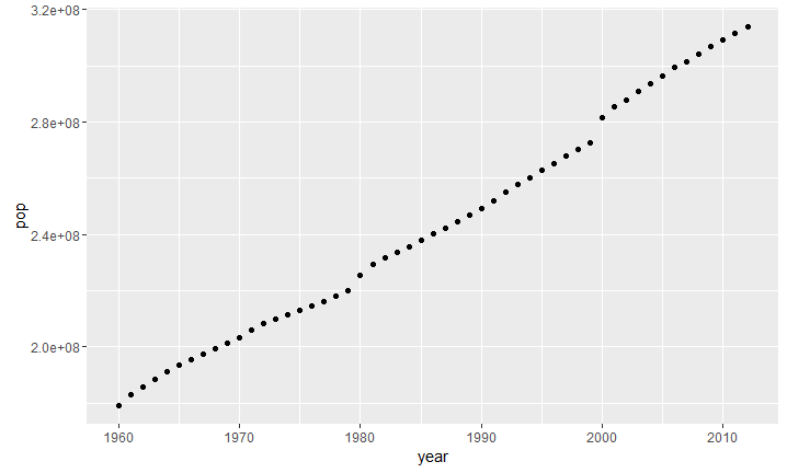
Figure 1: Population Plot
I start with the population plot, simply as an illustration of what turned out to be a thoroughly confounding variable. The population growth in the US over the time frame of the study was so great that total to total comparisons ended up being essentially useless. For example, here is the Spearman’s correlation between population and government employment: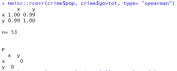
Figure 2: Spearmans Population Government Employment
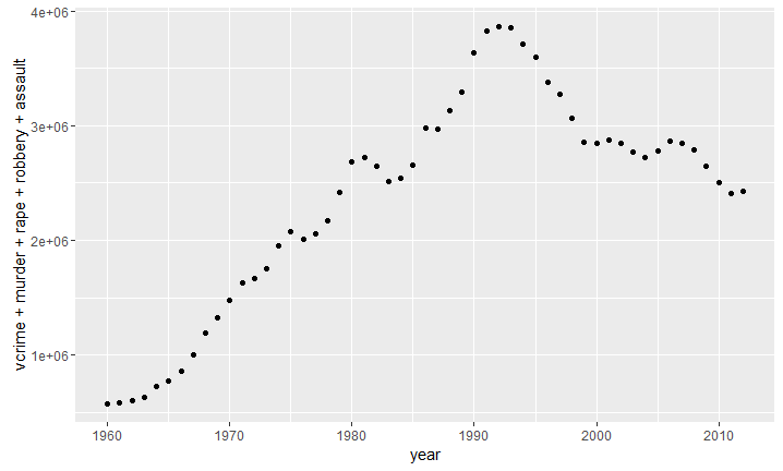
The two variables have a 99 percent correlation. As it turned out essentially every total measure had extremely high levels of correlation, primarily due to population growth. The US went from a population of 180 Million people to 320 million over the course of the study. This near doubling of the population made any non-rate measures effectively simply proxies for population growth. This does not mean that all of the totals pegged to population growth, murder and crime totals actually diverged pretty sharply from the straight line:
Figure 3: All Violent Crimes Added Together
This graph is actually all violent crimes, with all of them added again. Effectively a double picture of violent crime, I use it simply as an illustration of overall trends. Despite constant population growth, the total numbers of crimes (not just rates) have actually dropped significantly over the past few decades. This change is actually more pronounced for murder, where even the total numbers are currently around the numbers last seen in the early 1970’s, when the population was 120 million people less. That said, the murder rate is actually lower now than it was at the beginning of the period being looked at, so it is clear that even in the case of murder, population is a confounding factor.
Simple Plots, Histograms, Q-Plots:
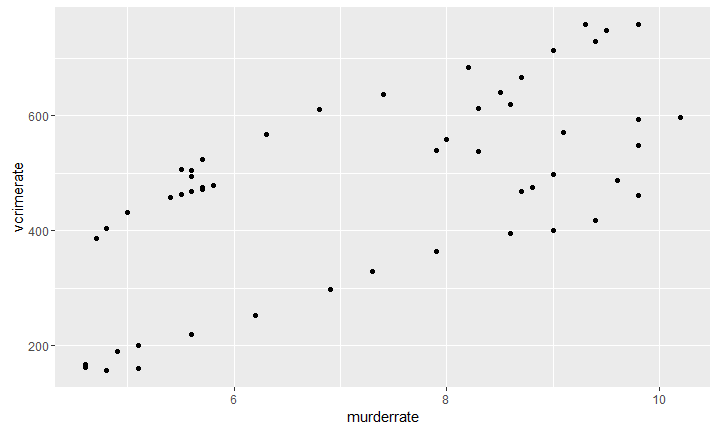
Figure 4: simple Plot of Murder and Violent crime
I include this simple plot of the violent crime rate and murder rate simply to highlight the ways that the two do not match up. The Murder rate is extremely low both at times when the violent crime rate is low, and when it is at a medium value.
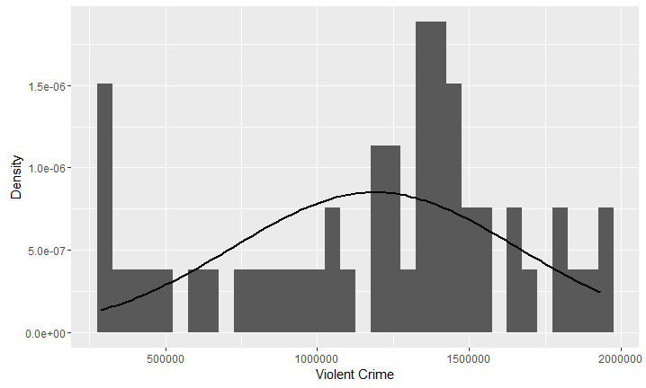
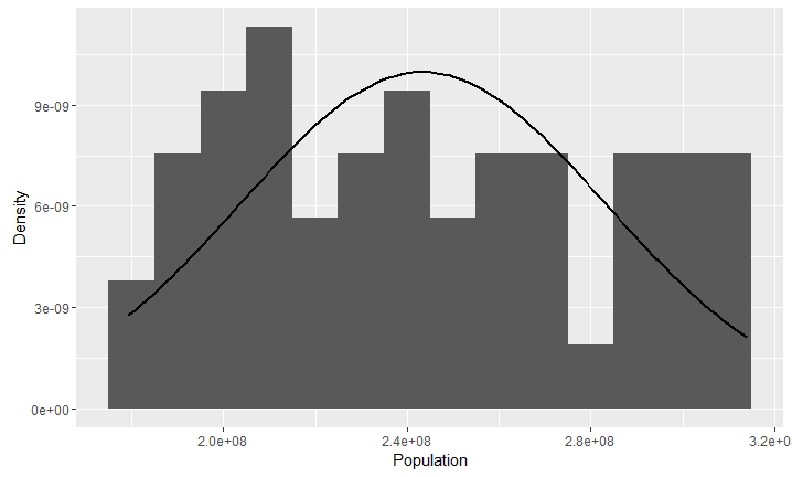
Figure 5: Violent Crime Histogram Figure 6: Population Histogram
Generally speaking, my variables did not appear to be parametric. As an example I include the violent crime histogram, which as you can see is pretty platykurtic. The Population variable strangely actually seemed to be pretty normally distributed.
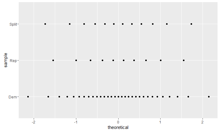
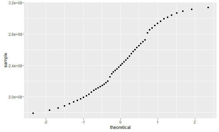
Some of the variables were more aggressively non-parametric than others. Obviously, the categorical variables, like Congress below, were non-parametric when Q-plotted. Surprisingly to me, the population variable still seemed fairly normal, albeit somewhat S-curved.
Figure 7: Congress Q-plot Figure 8: Population Q-plot
Correlations, Spearman’s and Pearson’s:
The following section is, sadly, a rather boring list of Spearman’s correlations. So to make it a little more bearable, I will simply start with the correlation that I found most interesting, and that ultimately became the correlation I investigated most.
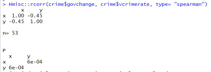
For some reason, there is a significant correlation between change in government employment numbers and the violent crime rate. In this case, the negative correlation means that as government employment increases violent crime rates drop. Is it possible that increased government services leads to lower crime rates? Very interesting, so I looked further.
Hmm, government employment changes negatively when Republicans control congress. This is not surprising, since it is a part of the party plank.
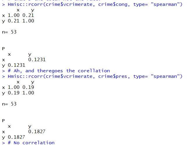
But uh oh, there is no correlation between government (President or Congress) and violent crime rates. So even though there is a correlation between Republicans and negative government job growth, and there is also a correlation between negative government job growth and violent crime, there is not a correlation between governing party and violent crime rates. I decided to look closer.
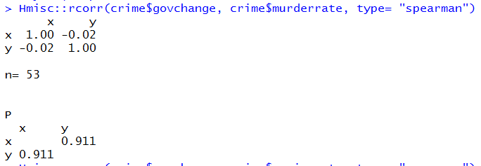
Well clearly there is no significant correlation between negative government job growth and murder rates. Is there a correlation between murder rates and violent crime? 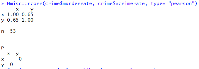
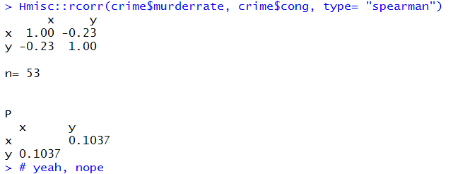
Yes, a pretty strong one, so how can murder rates not be correlated to negative government job growth? Is there a correlation between murder rates and congress?
That would be a no.
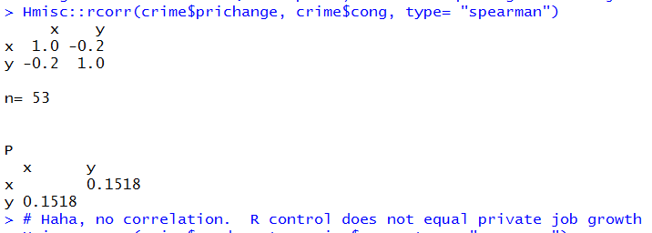
At this point I decided to let the mystery of the correlations between violent crime and government employment rest for a bit. I ran a lot of Spearman’s correlations, but I will spare you all of them except for one:
It looks like, despite the Republican reputation as the party of business there is no correlation between republican control of congress and job growth. Based on the correlations I ran it would
seem that neither party really has any idea how to make an economy work, it appears to be mostly random.
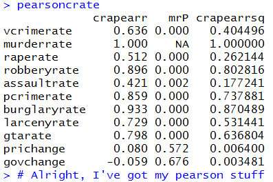
Also, just to show that I ran it, here is the Pearson’s correlation. It took a long time, but I did not do much with it.
Time Series Plots with Two-Sided Moving Averages and LOWESS:
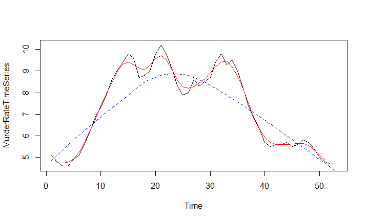
I spent a lot of time working on the time-series analysis, but it is a very complicated topic. I satisfied myself with producing lots with a moving average and LOWESS. At first I
simply assumed that this was a prettier way of plotting, but we will conclude with the graph I found most interesting and illuminating.
Figure 9: Murder Rate Time Series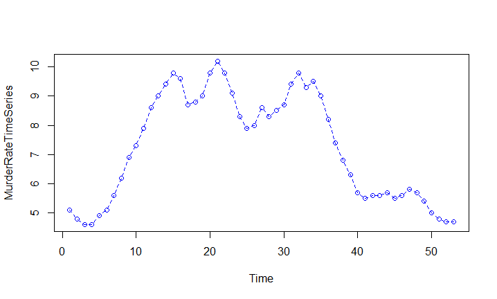
Figure 10: Murder rate with observations indicated
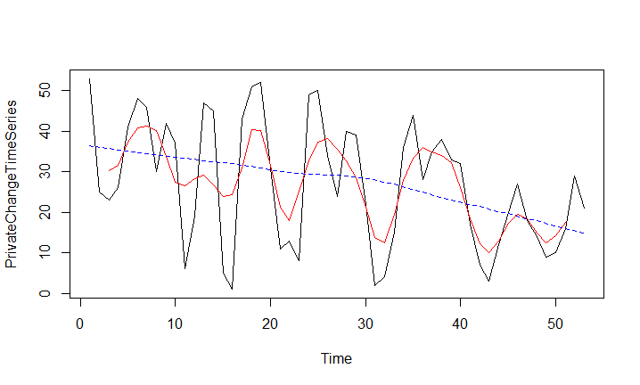
Figure 11: private employment change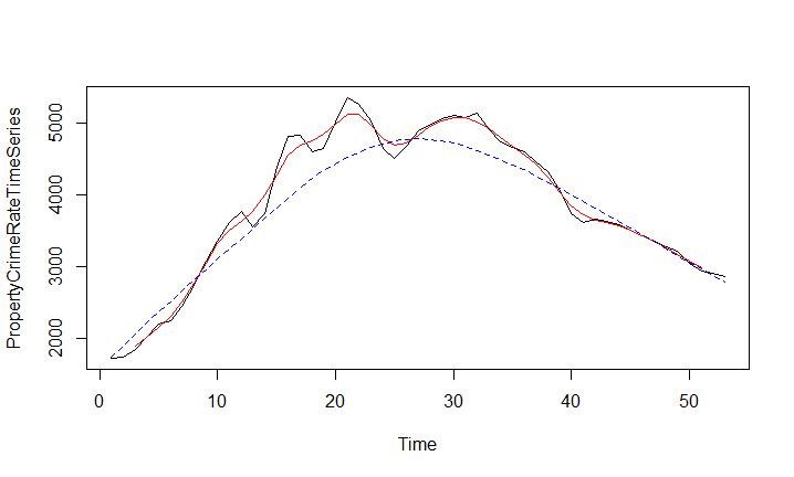
Figure 12: Property crime rate
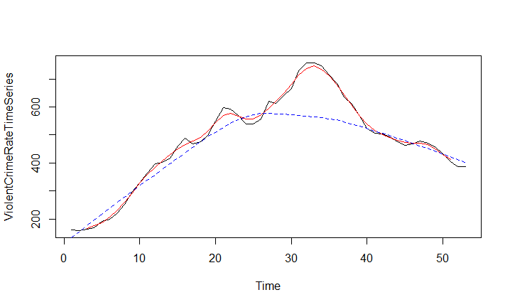
The property crime rate graph is worth seeing, just to see how closely the following violent crime rate graph correlates to it. This correlation is very strong.
Figure 13: Violent Crime Rates
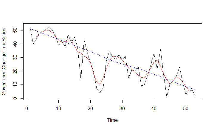
Figure 14: Government employment Change
And here finally, thanks to the LOWESS, we see the why for the negative correlation between violent crime and government change. The change is due to the way that I extracted the Government employment change data. Instead of extracting the numbers I extracted the percentage of change, and that means that as employment becomes more stable (percentagewise, partially due to the confounding variable of population growth and the effect on government size) the values drop. Since violent crime rates overall went up over the course of the study, and the level of government employment instability went down, there is a negative correlation. But I made the negative correlation. It was my bad statistics.
Primary Component Analysis:
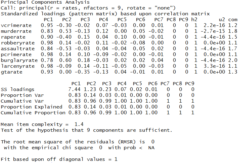
As a final piece of analysis I ran a PCA. I wanted to see if there was something I had missed:
Unfortunately, thanks to the way that I extracted the change data, I had to toss it out. Which meant that my PCA essentially just covered well covered ground analytically. I was able to run the PCA. Effective as a proof of concept, but a failure at trying to bring something new to the discussion. The PCA does seem to indicate that murder and burglary are less responsible for the overall variance in the model, but the eigenvalues are still 0.83 and 0.78 respectively. Every rate is significant.
Interestingly, looking at the inflection point, the Murder Rate is the second most important Primary Component, and looking at the eigenvalues, Murder rate and Burglary Rate are the strongest positive correlations, and bizarrely Assault Rate is negatively correlated with Murder Rate. Assault is also the eigenvalue next least associated with violent crime rates after Murder and Burglary. So, strangely, it looks like Murders, Assaults, and Burglary (while certainly associated with other crime rates) are the least pinned to other general rates.
Conclusion:
Ultimately, overall crime rates are strongly correlated. This is not a very useful or insightful observation. Also well discussed in the literature is the way that murder does not track perfectly to other rates of crime. The most important result for me was realizing how easy it is to mess up your own data. That at least is a useful lesson.
References:
Coghlan, A. (2010). Using R for Time Series Analysis. https://a-little-book-of-r-for-time-series.readthedocs.org/en/latest/src/timeseries.html
Zucchini, W. & Nenadi´c, O. (No Date). Time Series Analysis with R - Part I. http://www.statoek.wiso.uni-goettingen.de/veranstaltungen/zeitreihen/sommer03/ts_r_intro.pdf
Shumway, R.H. & Stoffer, D.S. (2010). An R time series quick fix. Time Series Analysis and Its Applications: With R Examples - Third Edition. http://www.stat.pitt.edu/stoffer/tsa3/R_toot.htm
FBI. (2016, Numerous Dates). FBI Crime Statistics Home Page. US Department of Justice. Federal Bureau of Investigation. https://www.fbi.gov/stats-services/crimestats
Bureau of Labor Statistics. (2016), (Dates extracted: 1960-2012). BLS Employment statistics. Quandl. https://www.quandl.com/data/BLSE/CES0500000001-Employment-All-employees-thousands-Total-private-industry
UCR. (2010). Datatool. US Department of Justice. Federal Bureau of Investigation. Uniform Crime Reporting Statistics. http://www.ucrdatatool.gov/